How a liquor store sign became our last album cover
Surprising i know. But here’s a little story about how our last album cover was inspired by a liquor store sign from Las Vegas, Nevada (it’s not as exciting as it sounds).
Mark and I were putting the finishing touches on the album that is now our BAZAR release. We wanted something that was like a bright neon corner of nowhere sign. So we went to Flickr and put in our keywords. Turns out Roadsidepictures, a guy that I already follow had the best stuff.
One of his pics in his signs set was of a liquor store called “Charleston Bazar”.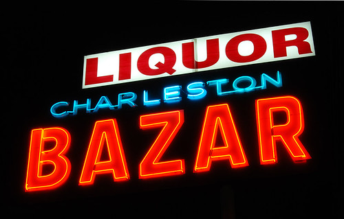
We liked that it was the same concept as our Solamente Tres Palabras album cover but a different take on it. The Solamente cover was a lone street light poking out in a blue natural gradient sky. This picture was a neon light at night doing what it does– burning it’s message in the dark, offering a promise of who knows what’ll happen tonight.
I drew up a version of it with our name in the sign to make it look like a neon sign but it never panned out just right. So I made a really gritty version of it and screen printed it to look like one of those old punk rock flyers where they would just draw and paste words on a page.
Except unlike those old flyers, ours was 3 colored.
<div class="separator" style="clear: both; text-align: center;"> </div><div class="separator" style="clear: both; text-align: left;">
</div><div class="zemanta-related"><h6 class="zemanta-related-title" style="font-size: 1em; margin: 1em 0 0 0;">Related articles</h6><ul class="zemanta-article-ul"><li class="zemanta-article-ul-li">Melancholy Hill by Gorillaz, Animated Using NYC Neon Signs (laughingsquid.com)</li><li class="zemanta-article-ul-li">Happy 100th Birthday to the Neon Sign (laist.com)</li><li class="zemanta-article-ul-li">Photographs of broken neon signs. (slate.com)</li></ul></div><div class="zemanta-pixie" style="height: 15px; margin-top: 10px;"> </div>